Your Pricefy pricing dashboard is the home screen you land on after logging in — a real-time overview of how your prices compare to your competitors. It pulls the key numbers, charts, and tables together in one place, so you can see where you’re winning and where you’re overpriced without digging through the catalog.
Open the Dashboard
Click Dashboard in the sidebar (Pricefy also opens here right after you log in). The header shows Last Updated with how fresh the data is.
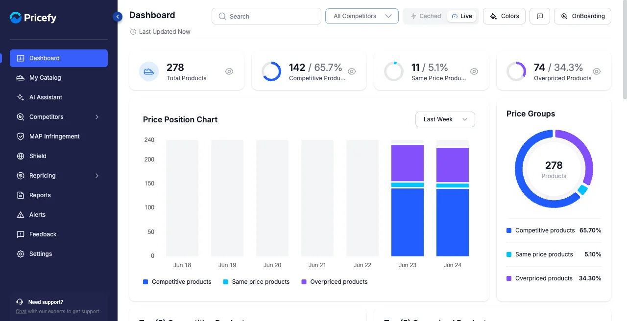
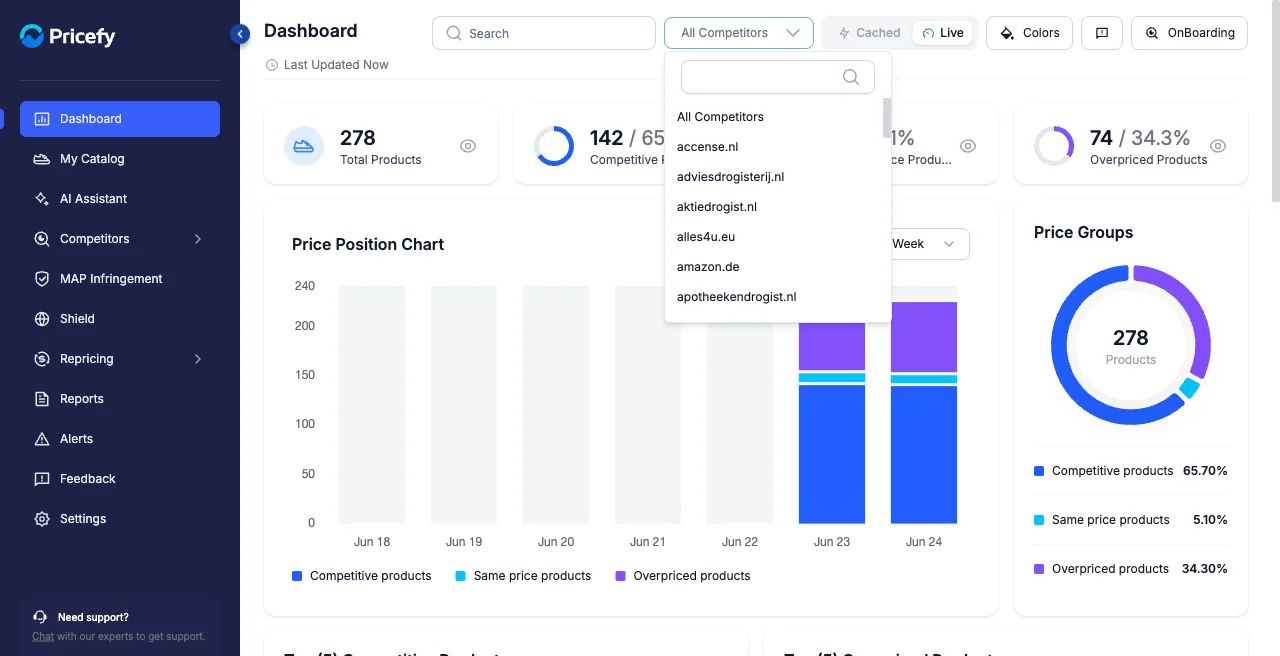
The numbers at the top
Four cards summarize your whole catalog at a glance. Each shows a count and a percentage:
- Total Products — how many products Pricefy is tracking for you.
- Competitive Products — products where your price beats the competition (you’re the cheapest).
- Same Price Products — products priced the same as a competitor.
- Overpriced Products — products priced above the competition, good candidates to reprice.
Price position over time
The Price Position Chart plots, day by day, how many of your products were competitive, same-priced, or overpriced — so you can spot trends. Use the range selector to switch between Last Week and Last Month.
Next to it, Price Groups shows the same split as a donut, with the exact percentage of your catalog in each position.
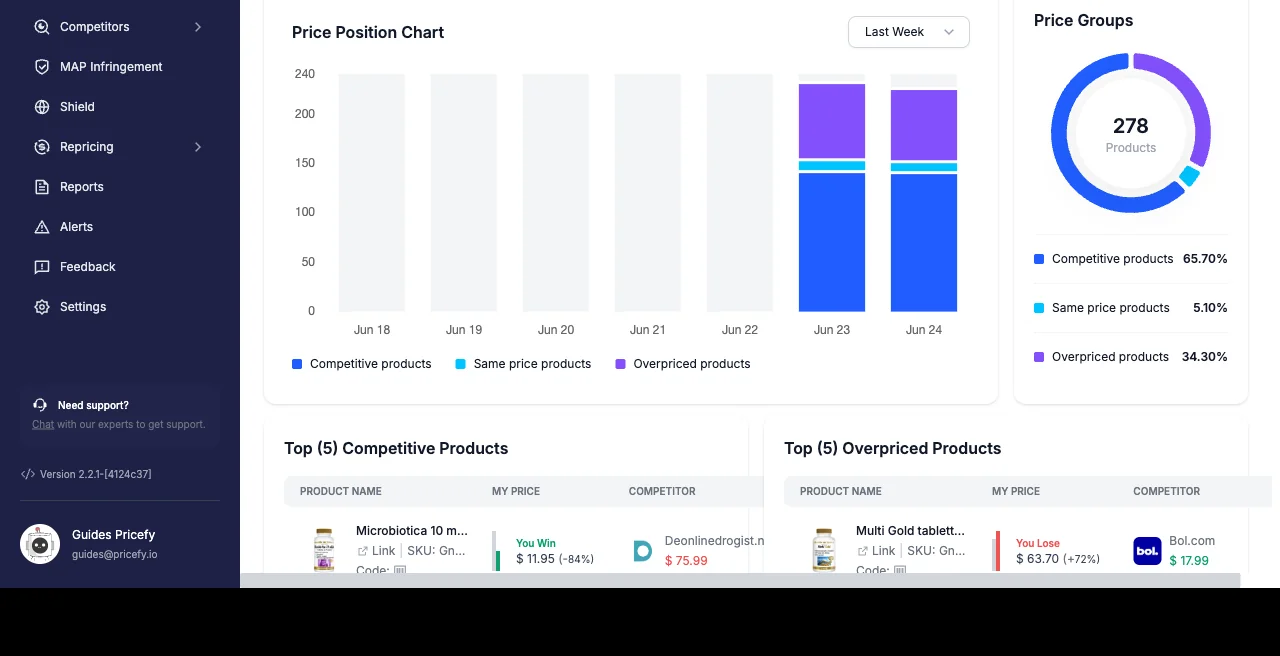
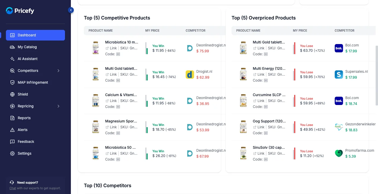
Your best and worst-priced products
Two tables surface the products that need your attention most, each with your price and the competitor it’s compared against:
- Top Competitive Products — your five best-priced products, flagged You Win.
- Top Overpriced Products — your five most overpriced products, flagged You Lose.
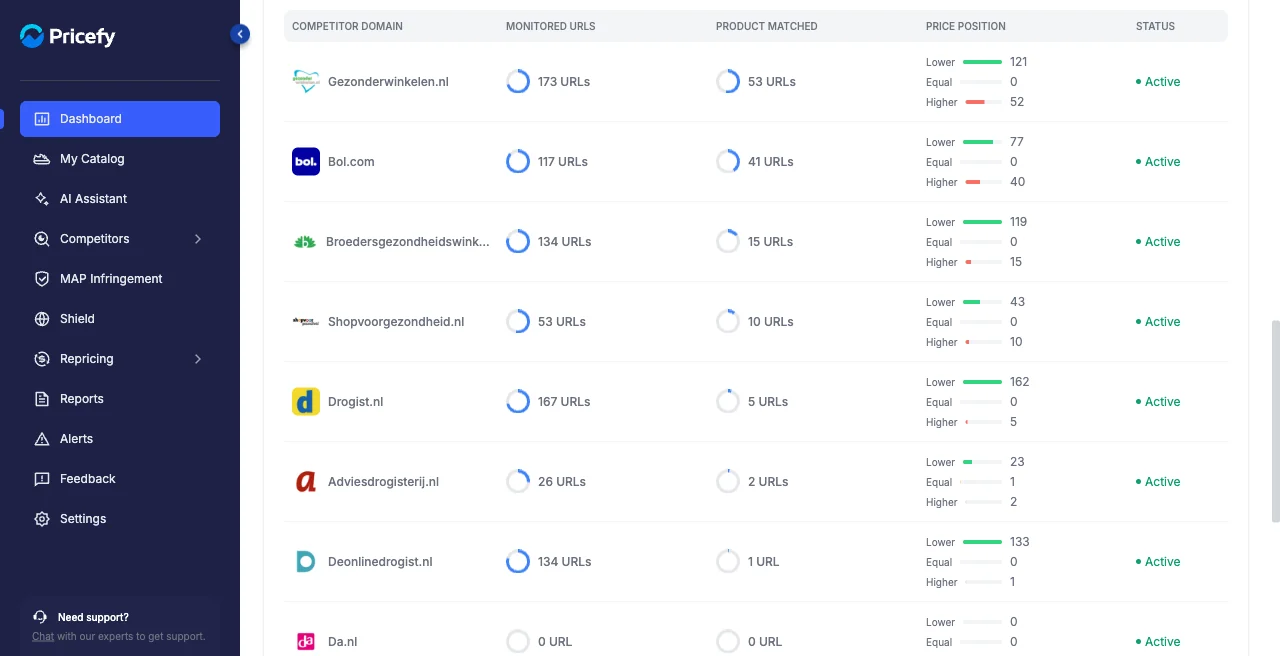
Top Competitors
A ranked table of the competitors Pricefy monitors for you. For each one you see:
- Monitored URLs — how many of their pages you track.
- Product Matched — how many of your products are matched to them.
- Price Position — how many of your matched products are priced Lower, Equal, or Higher than theirs.
- Status — whether monitoring is Active.
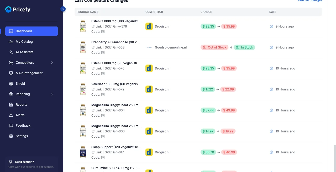
Recent competitor changes
The Last Competitors Changes feed lists the latest price (and stock) moves Pricefy detected on your competitors, with the old and new value and how long ago it happened. Click View all changes to open the full history.
Customize the view
The header controls let you tailor the whole dashboard. Open the All Competitors dropdown and pick one competitor to recalculate every widget against just that rival.
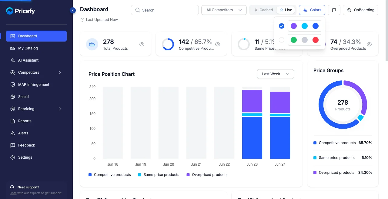
Colors sets the colour scheme used for the three price positions across the charts — pick the blue/cyan/purple set or the green/grey/red set, whichever you read faster.
Finally, the Cached / Live switch controls the data: Cached is instant, from the last computed snapshot (the Refresh button rebuilds it), while Live recomputes on the spot, so Last Updated reads Now.
Good to know
- The dashboard described here is the merchant view. Brand accounts see a different, brand-focused dashboard.
- Need a guided tour? Click OnBoarding in the header to reopen the setup walkthrough.